16:9 Image Aspect Ratio
Constrain an image to a standard 16:9 video ratio.
16:9 Image Aspect Ratio rendered preview

Data feedback
Displays content within a fixed ratio like 16:9, 4:3, or square.
pnpm add @quinkit/uiimport { AspectRatio } from "@quinkit/ui";Live previews · code · themes · viewport · dark mode
Constrain an image to a standard 16:9 video ratio.
Keep responsive video embeds perfectly proportional.
Square 1:1 aspect ratio card media container.
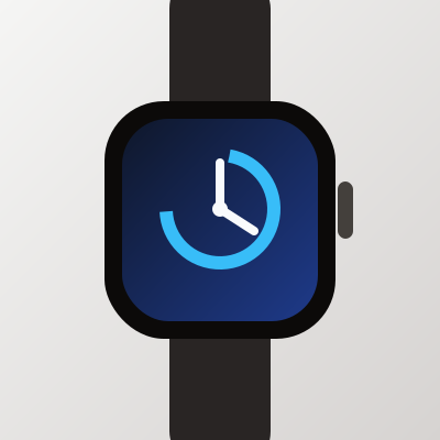
Smart Watch v2
$299.00
Wide aspect ratio hero media banner.

Placeholder aspect ratio container when image fails to load.
AspectRatio is part of the Week 4–6 free core component set. It follows the shared component standard with TypeScript exports, semantic token styling, accessibility-minded markup, and Storybook examples.
bg-background, text-foreground, border-border, bg-popover, and text-muted-foreground.AspectRatio adheres to WAI-ARIA design patterns for accessible web components.
Keyboard Navigation
Tab / Shift + Tab — Focuses control and moves between interactive elements.Space / Enter — Triggers action or toggles selection.Escape — Closes open popovers, overlays, or dropdown menus.ARIA Standards
aria-* attributes.ring-ring) visible in both light & dark mode.Add a shadcn-compatible bridge file to your project that re-exports from @quinkit/ui.
npx shadcn@latest add https://quinkit-ui.vercel.app/r/aspect-ratio.json